Mobile form design: 9 practices that boost conversion
Not sure how to create beautiful and effortless mobile-friendly forms? Use these nine design tips to design striking forms that get you more—and better—data on any device.
.webp)
Contents
Not sure how to create beautiful, effortless mobile-friendly forms? Use these nine mobile form design best practices to create striking forms that get you more—and better—data on any device.
Every few decades or so, humankind creates something that truly revolutionizes how society does things. From the lightbulb to automobiles to the modern-day internet—we’ve seen nearly every kind of advancement.
One of the most recent innovations? The smartphone.
You might be reading this on your phone. Or endlessly scrolling social media. Maybe you’re shopping on Amazon or using your mobile banking app.
Chances are, you’re doing almost anything other than what phones were originally built for—calling people.
You’re not alone either. In the second quarter of 2026, 51.48% of global website traffic came from mobile devices.
What’s that mean for you? Whether it’s your website, lead magnet, or product recommendation quiz, they all need to be optimized for mobile to create a smoother experience for visitors across devices.
Don’t worry—we’re sharing nine mobile form design best practices to help you create responsive forms that function well and look good on any device, plus why mobile optimization matters.
Form, quiz, and survey best practices
Before you get too focused on creating mobile-friendly forms and fully optimizing design, nail down the basics.
We've rounded up a few general best practices to make your forms effortless to fill out, whether form-takers complete them on a desktop or mobile device.
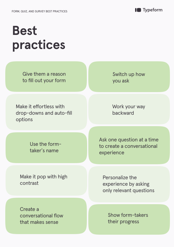
Give them a reason to fill out your form
Every time someone fills out your form, they’re giving you priceless data that can inform product development, improve your customer experience, or focus your marketing. Give them something in return.
An incentive—whether a discount, quiz results, or a downloadable resource—shows form-takers you value their time and data.
Make it effortless
Thanks to autofill and autocorrect, we’ve become used to shortcuts, especially when typing or tapping on our phones. Carry this over to your form or quiz by using features and question types that reduce unnecessary typing, such as dropdown menus and other easy-to-select options.
Switch up how you ask
Keep form-takers engaged by mixing up how you ask questions. A variety of Picture Choice, open-ended, multiple-choice, and yes/no questions can help keep the experience varied.
Use the form-taker’s name
Build a connection with your audience and personalize the experience by referring to your form-taker by name. Refer back to previous answers to recall their name in one or more of the following questions.
Work your way backwards
Instead of building your quiz or survey from the first question, work backwards. What data are you trying to collect? What information do you want? Knowing the end goal helps you ask the right questions.
Make it pop with high contrast
Make sure your forms are accessible and easy to complete by making them easy to read. Use text that contrasts with the background, especially for elements meant to stand out, like call-to-action (CTA) or “Submit” buttons.
Ask one question at a time
You wouldn’t bombard a friend with 20 questions all at once—don’t do it with your form or survey either. Ask one question at a time to make your form feel more like a conversation and keep form-takers moving through each question.
Create a conversational flow
Just like you wouldn’t ask a friend a bunch of questions at once, you likely won’t change topics with every question. Group similar questions—like demographics or preferences—before moving on.
For example, consider asking for their name and email before asking for feedback and whether they’d recommend your product.
Only ask relevant questions
No one wants to answer questions not relevant to them. As you build your form, only include necessary questions and consider using Logic to automatically route form-takers based on their previous answers. This helps ensure they only see questions that are relevant to them.
Show their progress
Let your form-takers know how far they’ve come and how much they’ve got left until they finish your quiz. A time estimate on the Welcome Screen gives them an idea of the time commitment, while a progress bar shows how much of the form they’ve completed.
Best practices for mobile forms: 9 design tips
As more of us use our phones as mini tablets, we expect the brands we love most to adapt and create mobile-friendly forms, websites, and experiences.
Don't worry—we're sharing nine design tips to help you create optimized mobile forms that look great on any device.
1. Create responsive forms
While we spend a lot of time on our phones, we often switch between devices. We might find a brand on the Instagram app but prefer shopping on a desktop. Or watching shows on our tablets.
And that's why creating responsive forms is vital to a better user experience (UX). Mobile-friendly forms are optimized to perform well on mobile, but responsive forms adjust to any device.
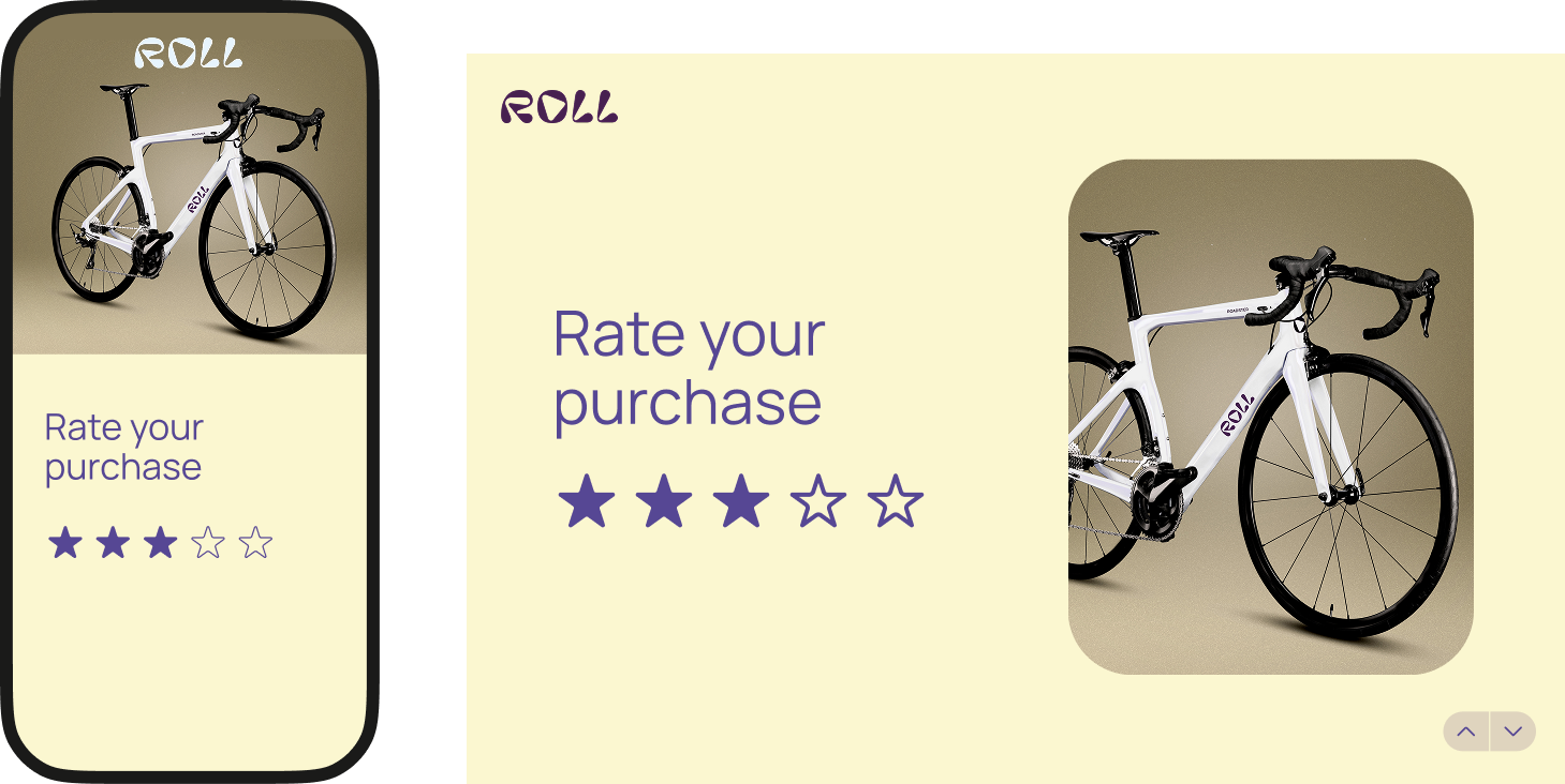
So, whether someone uses a phone, tablet, or desktop computer, responsive design helps make sure the form works well across different screen sizes and devices.
Typeform also lets you preview forms in mobile view and customize certain image layouts for desktop and mobile devices.
2. Make your forms accessible
Your customers (or audience) likely aren't one-size-fits-all. Some may struggle reading small text or have sensory or cognitive disabilities, so make sure you create mobile-friendly forms that are accessible.
Here are a few things to consider:
- Are you prioritizing aesthetics and design over readability?
- When you use images in your form, do you provide alt text?
- Are you using a readable font in colors that contrast with the background?
- Do you have too much text to easily read on a mobile screen?
- Can form-takers view and complete your form in both landscape and portrait mode?
- Do you provide captions for audio or video elements within the form?
- Does the text pixelate when form-takers zoom in?
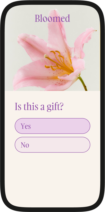
These are the basics, but you can also check your form's accessibility with a tool. Typeform's built-in accessibility checker checks areas including color contrast, image alt text, and whether question types are accessible.
Pro tip: Keep in mind that mobile devices have smaller screens—just because it looks good on your computer doesn't mean it's accessible on smaller devices.
3. Keep them short
We’re all busy—respect your form-takers’ time by keeping your survey as short as possible. Ask only enough questions to get the data you need.
Our research found that typeforms with more than six questions had less than a 50% completion rate.

Need to collect a wealth of data? Consider splitting it across multiple forms or follow-ups so form-takers don’t have to work through a long list of questions all at once.
And remember, form-takers are likely tapping buttons or typing on a tiny keyboard on their phone—it gets tedious after a few questions, which could increase drop-offs and reduce completions.
4. Limit open-ended questions
If you've ever opened an email on your phone but waited to respond until you've got your laptop with you, you know exactly why we suggest limiting open-ended questions.
Writing a paragraph or more on your phone is a pain. Typing using those tiny letters takes more time and is often frustrating. You want to tap more, type less.
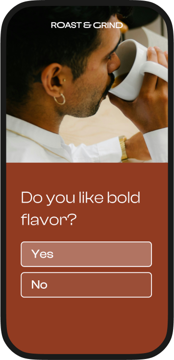
So, when creating mobile-friendly forms, use fewer open-ended questions and change up question types, like:
- Yes/no
- Rating and ranking
- Multiple choice
- Dropdown lists
- Picture Choice
These question types can reduce the amount of typing required and give form-takers more tap-friendly ways to respond.
5. Make mobile-friendly forms that load fast
Fast load times matter, especially on mobile. If a form takes too long to load, visitors may leave before they ever reach the first question. Prioritize performance when designing mobile-friendly forms.

One of the biggest contributors to slow load times? Media. Images and video can make a form more engaging, but large media files can also add weight and slow down the experience. Use media thoughtfully and optimize file sizes when possible.
6. Design clutter-free forms

Want to create mobile-friendly forms that look great, too? Consider decluttering. What feels manageable on a desktop can quickly feel cramped on a smaller screen.
Here are a few ways you can design a clean look without sacrificing data:
- Use white space to give questions and answer options breathing room—it makes your form less overwhelming
- Get rid of distractions, like an explanation for every question
- Stack fields vertically and keep answer options in a single column when possible
- Keep questions and field labels as concise as possible—long answer options can add visual clutter on smaller screens.

Optimized mobile forms can be both beautiful and functional without being busy. One of the easiest ways to do this is to ask one question at a time. Ask a form-taker for their name in one question and then ask for their email in the next. It's less distracting and opens up space.
7. Make navigation tap-friendly
Phones are tiny—the keyboards are even smaller. Make it as effortless as possible for form-takers to complete your form on their phone by using tap-friendly question types and large, easy-to-select controls.
Mobile-friendly forms should make it easy for people to tap answers, arrows, and buttons. Here are a few ways to make moving through and submitting the form easier:
- Make arrows or buttons large enough to tap comfortably on a small screen.
- For single-select questions such as Multiple Choice or Yes/No, keep answer options simple so respondents can move through the form quickly.
- Make the “Submit” button easy to spot with strong contrast and enough visual prominence that respondents won’t miss it.
8. Have clear error messages
One of the most important best practices for mobile forms is giving form-takers feedback throughout the form. Use asterisks (*) to mark that a question is required or tell visitors when a question is optional.
When someone tries to move past a required question without answering it, Typeform displays a prompt telling them the question needs an answer before they continue.

Clear error messages help form-takers understand what needs to be fixed so they can keep moving through the form. Typeform also lets you customize system messages, including errors for required answers and validation issues.
For example, if you have a product recommendation quiz, tell form-takers to enter their email and submit the completed form to get their results.
9. Preview in “mobile view”
Want fully optimized mobile forms? Get a sneak peek of what your form will look like on any device before you publish it.
Sure, you could publish your form and then test it on mobile, tablet, and desktop. Or you can use Typeform's preview mode to see how your form will look before publishing. Click the mobile icon in preview mode to check the mobile experience.
Create mobile-friendly forms by checking for glaring issues in preview mode, like:
- Button and text sizing
- Color contrast
- The number of form fields
- Your "Submit" button
- Image alignment
Pro tip: Use Typeform’s mobile-friendly form guide as a checklist before you build your next form.
Why optimized mobile forms matter
These design tips are about more than making pretty mobile-friendly forms—they help create better mobile experiences that can make forms easier to complete and help you collect the data you need.
Zero-party data (ZPD) collection
Optimized mobile forms encourage users to complete the form, giving you invaluable zero-party data (ZPD) every time someone taps "Submit." Whether it's their contact details, customer feedback, or preferences, you get data to help you refine marketing, build better products, and more.
And because you've created responsive forms, you can gather that data on any device.
Meeting people where they are
There's a reason millions of businesses have taken their businesses online and e-commerce is booming—because that's where people shop. Likewise, 68% of typeforms are started on mobile, so it only makes sense to make mobile-friendly forms.
Your audience is on their phones. By meeting them where they are, you encourage them to start—and finish—your form.
Creating a better experience
Optimized mobile forms give form-takers a positive form-taking experience because they prioritize the UX. Every design tip we've shared focuses on making it almost a no-brainer for form-takers to complete your form with very little effort.
And when you make the experience simple and pleasant, you can reduce friction and make it easier for form-takers to complete the form.
Building trust and loyalty
Forms not only deliver the data you need, but they can also help you build long-term loyalty by creating thoughtful, user-friendly experiences.
Optimized mobile forms let form-takers know you care about their experience on any device, but they also show that you want to understand audience needs, preferences, and feelings.
That care can help build trust and make form-takers feel more comfortable sharing information with you. Creating positive, customer-centered experiences can also support the deeper connections associated with customer loyalty.
Mobile-friendly forms, meet marketing
Forms, quizzes, and surveys are more than just a fun way to engage your audience—they're powerful marketing tools. When done right, mobile-friendly forms can integrate seamlessly into your marketing strategy.
Here's how:
- Generate leads with contact forms or lead magnets that help you uncover audience wants and needs, and then score leads based on their responses.
- Collect feedback with feedback forms that help you understand how to improve your customer support or product.
- Get more sales with product recommendation quizzes that form-takers can complete on their phones and then shop their recommendations. You can even integrate Stripe to make shopping seamless—driving more sales.
And you can do all this by creating responsive forms that let form-takers complete your forms on any device, hassle-free.
Create mobile-friendly forms with Typeform
Form-takers won't struggle through a clunky form that's hard to navigate—especially not on mobile. We consume content, fill out forms, scroll social media, and even shop on our phones.
Brands that adapt to mobile-first experiences can create a better UX across devices and make it easier for people to complete forms wherever they are.
So, if you're ready to design mobile-friendly forms, use the tips we've shared and leverage Typeform's preview mode to ensure your forms look great on all devices before they go live.
With 3,000+ templates, mobile preview, and responsive design built in, Typeform makes it effortless to create—and fill out—forms for you and your audience. Ready to try Typeform?